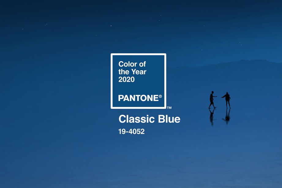
Learn more about Classic Blue – the color of 2020
A new decade is about to start with many surprises and challenges. As usual, the time between the old year and the new year is also when Pantone Institute of Color proclaims the color of the next year, and in 2020, PANTONE 19-4052 Classic Blue – Classic Blue is the name that was chosen.

The classic blue gives us a constant and nostalgic feeling. This is the color that symbolizes the twilight sky, the perfect suit, the peaceful water, or simply the bowl of ripe blueberries.
Pantone’s decision to choose the classic blue color for 2020 will bring color shaping of the year to the overall design. Taking a look back to more than 20 years ago in 1999, Pantone’s color choice was Cerulean – blue, a peaceful shade that represents the excitement of entering the new millennium and easing anxiety in a generation. The impact of Cerulean that year greatly influenced cultural ideology, from home decoration trends to high fashion. A typical example of this influence can be seen in the monologue of the character Meryl Streep as Miranda Priestly in The Devil Wears Prada, where she disrupted the dominant way of color in the global industry.
So perhaps it is not surprising that at the end of a decade, Pantone decided to return to the blue color, as a sense of honoring the classic values, allay anxiety with challenges and hope to open up a new and more wonderful stage.

“Just like that time (1999), we all shared the same feeling of worry about the changing of the world. Based on what happens in global culture, we chose Pantone 19-4052, Classic Blue, which is the color of 2020” said Laurie Pressman, the vice president of Pantone Colors Institute.
“This is a peaceful blue, full of calm and confidence. It brings people together”

Victor VIRGILE / Gamma-Rapho
Pressman notes that Pantone feels the classic green arouses confidence, solidity and steadfastness, a collection of elements of great value in the context of the stress and hustle of the current pace of life. She also pointed out that blue is the color of the sky at dusk, an explanation of why this color brings a vibe to many people.

“The sky at dusk – not midnight blue, it is pensive, but not too dark and mysterious,” she said. “When looking at the twilight sky, it brings a sense of anticipation about the future, when the day is not yet over. What are you thinking about what lies ahead? It reassures us, but also stimulates thinking. The color green emphasizes our desire for a solid foundation, creating confidence to cross the threshold of entering a new era. We live in an age that requires trust, faith and confidence. The blue that we all see in the sky will give us different feelings ”

WireImage — 2019 Victor Boyko
Indeed, cyan seems particularly suited to the moment, a color that is not gender-independent, regardless of the season, easy to use and suitable for everyone in all classes. In addition, blue can be created naturally from plants and dyes, it becomes a color suitable for the sustainable movement, continuing the value and message that coral orange – Living Coral 2019 has bequeathed.

Some may associate classic blue with nostalgia or rule, but Pressman asserts that Classic Blue is a symbol of modern heritage, which is why it has a distinctive beauty of the time imprint, like an off-white luxury jewel, or a traditional outfit by American composer Ralph Lauren.
“We look to the old values because things are becoming more chaotic,” Pressman said. “It does not mean doing what it has done, but using the old value to inspire the creation of new things.”
Editing: Thao Lee
Author: Cady Lang
Source: time


